24.7.10

Politics In Print: The Bandanas

As promised yesterday, here are some images from my time at Double Elephant Print Workshop printing my politically inspired bandanas. Measuring 18" square, the Devon-centric design is printed in black onto 100% cotton and incorporates a "made in Devon" signature that locates the hand-produced nature of the site-specific work - more details about the political narrative and the subjects featured will follow shortly as well as information about the exhibition that will open in Exeter in September and will begin touring around Devon County thereafter. If you would like to know more about this work in advance or any other of my commissions or projects that may be viewed here, please do not hesitate to get in touch with me at jmvelardi@yahoo.co.uk
Until then, look out for more Politics in Print updates throughout the summer!

23.7.10

Sun Screen

Since I've been down in Devon I was determined to title this entry, "when it rains, it pours". The fact that every time I've had to make a trip Westwards the dark rain-filled clouds have never failed to welcome me. So why should things have been different this time around? Well, to begin with they weren't and my bad karma has become quite the joke at Devon Record Office and Double Elephant Print Workshop, but it is amazing what a few hours of bright sun can do to a sceptical soul and with yesterday's burst of rays I've decided not to dictate this post by weather(!)
My recent visit has been very hands-on - I have been printing my bandanas for the Politics in Print commission at Double Elephant and it's felt great to be back in a print studio and producing again. Established in 1997 by Simon Ripley and Lynn Bailey, Double Elephant is a fantastic resource for fine art printmaking and it's been a pleasure to work in the studio and meet a few of the members who use the studio and contribute to such a creative and supportive environment. As all printmakers know, once your image is burnt onto the screen or transferred to the plate, the process of multiple production can begin and the adrenaline hits. Armed with my squeegee, my monochrome multiples were ready to be printed on crisp 100% cotton sheets - here are a few previews of my design on the screen inspired by Devon's political history. Be sure to visit jonathanvelardi.blogspot.com tomorrow for images of the finished prints...
And to prove I'm not lying about the sun, here are some shots from Exeter's historical Cathedral Yard which is a short walk from Double Elephant down Gandy Street and over the High Street.
This part of the city is the only area that survives after severe German bombings in the Second World War - surrounded by buildings from as early as the seventeenth-century, Exeter Cathedral stands proudly in the face of history since 1400. Noted as having the longest uninterrupted vaulted ceiling in England as well as the ornate bosses that decorate it, the cathedral has been the seat of the Bishop of Exeter after it was transferred from Crediton in the late eleventh-century and Crediton happened to be where I have been staying this week. Just North West of Exeter, the town of Crediton has one of the most unique parade of shops I have ever seen on my travels and with the rolling hills that surround this typically Devon town, it is most definitely worth a visit in rain or shine!
More on my Politics in Print commission tomorrow!

19.7.10

Two Scoops Of Talent

Summertime is hot in the concrete jungle but New Yorkers need fret not for the artist duo Smith & Lowles are offering up some sweet treats for you to sink your eyes into. George Smith and Amy Lowles met whilst at The Slade School of Fine Art - a year above me, they were an inspiration respectively with their visions of larger than life film sets and effortless ease at creating mystical scenes from objects of the everyday through a camera lens. Having tasted the infinite opportunities New York had to offer when they were both awarded a place at Cooper Union School of Art in the East Village for a semester in 2004, it was only a matter of time that as soon as they had graduated from The Slade, New York was calling them back. Four years later, London has greatly missed out on the talented collaboration that is Smith & Lowles who now live and work in Brooklyn. When I was stateside for a couple of months last year we had such a great time and you never know what to expect - their studio was a toxic tropical installation of all things Americana and for the last few months snippets of bizarre details all make sense with the launch of their latest video, Knickerbocker Glory (2010). I can relate with their outsider-looking-in approach towards America in their practice, and at a time when change, however slow, is bracing the weird and wonderful U.S. of A., Georgie and Amy are, as ever, on the pulse. Well done my friends! Ladies and Gentlemen, may I introduce you to The World of Smith and Lowles.
Knickerbocker Glory, 2010 - video still

The Mad Scientist


Check out creatives-in-their-own-creative-world photographer Todd Selby a.k.a. The Selby's new shoot with artist, Tom Sachs in his New York City studio. I'm a big fan of Sachs and his studio looks like the official headquarters of FUN. Everything from his chess sets, tequila bottles, the humorous 'Prada Oil' and his very own version of the Kelly Bag (2009), to his obsession with NASA - I figure the bespoke NASA oxford shirt must be a requirement when you've built your own spaceship - invites the viewer into what I am sure is only a glimpse of the perverse, radical and witty world of Mr. Tom Sachs.

Click here for more from The Selby's series, The Selby is in your place.

17.7.10

The Bandana

It's been a while since I last posted anything about my latest commission, Politics in Print. My last entry spoke about my visit to Devon's Record Office and since then I've been very busy going through my notes, photos and research to see if any political veins could be followed and used to contribute to my proposal of producing a cotton-sqaure or bandana that would form a political journey of Devon's identity with symbols and text around the square print. Well, I can proudly confirm that my research was profitable, and if I'm honest, I had my doubts, especially when confronted with hundreds of thousands of index cards that were my only tools of accessing the vast archives!
With my design now complete, I will be returning to Devon this week to begin screen-printing the bandanas at Double Elephant Print Workshop in Exeter. Since I'll be blogging all week about my stay in Exeter while I document the process and production of the works I thought I should give you all a brief history of the bandana since I know it's one of those familiar objects in society that holds particular significance and stereotype. Cotton-square, bandana, kerchief or pocket-square are all terms that describe the cloth square that is understood to be invented by Richard II of England in the late fourteenth-century to wipe his nose. Eight centuries later, it has been adopted by various religious faiths and by international cultures as a means of symbolic gesture or identity. Originating from the Hindi word bandhana which means "to tie", bandanas have been the cloth of choice of labourers such as farmers and cowboys to the revolutionaries in political history. With their practical use such as keeping dust out of a cowboy's face; hiding stains on a labourer's collar and concealing the faces of anarchists during protestations, the bandana - commonly decorated with a paisley motif - has been a symbol of identity leading to its most politically charged role amongst gang subcultures during the 1980s and early nineties. Predominantly in California, where criminal gangs divide territory between red cloths (the Bloods) and blue cloths (the Crips), the once practical cotton-square has since transformed into a visually loaded object with it's particular designs and formations that contribute to a complex code which could determine one's life or death. In England, the cotton-square is just as appropriate today in the fields of Devon as it in the bespoke tailors of Jermyn Street in London and I have been interested in the cross-fertilisation of this object that has transcended utility and visual reference through history. Previous examples of my work have used the style of a bandana as a way of recontextualizing themes in my practice onto cotton squares (click here) and silk scarves (click here). So if you didn't think legendary actor, director and producer John Wayne, the late rap artist Tupac Shakur and the West Country's very own 'Scrumpy and Western' band, The Wurzels had nothing in common, the cloth around their heads and necks are what tie them all together.
John Wayne in Stagecoach, 1939
Tupac Shakur 1971-1996
The original Scrumpy and Western band - The Wurzels
Visit jonathanvelardi.blogspot.com for more information about my commission for Devon County Council and Double Elephant Print Workshop all next week. Have a great weekend everyone!

13.7.10

A Toast To Pop

With his paintings of celebrities and icons of the Sixties, Andy Warhol created a buzz around him at his creative headquarters The Factory in Midtown, Manhattan and with any buzz there has to be bubbly. So it comes as no surprise that the world's most prestigious Champagne has decided to honour Warhol with a series of limited edition bottles in a series of colourways that befits the artist's painting palette as I'm sure it would his taste palette were he alive today. Dom Pérignon is not foreign to creative collaborations in recent years - Karl Lagerfeld and Marc Newson have worked with the notorious Champagne house on a number of designs that have explored the brand's simple, yet iconic, bottle and label. 
Dom Pérignon brilliantly toasts the artist who has made Popular Culture what it is today. Leave the cans of Campbells at home and raise your glass in style... Salute!

Write Foot Forward

Two American names come together for the latest art-meets-fashion collaboration. Keds, the canvas shoe brand, is sponsoring The Whitney Museum of American Art Summer Season and have created The KedsWhitney Collection with the conceptual touch of American artist, Jenny Holzer. Holzer who is famed for her public interventions of projected words and seductive LED signs, puts her mark on two styles of shoe - Champion and Champion Hi - emblazoned with the phrase from her series, Survival: PROTECT ME FROM WHAT I WANT. Profits from the Jenny Holzer line will benefit the Whitney Museum of American Art - for more information about the Summer Season which features daily live music performances by Christian Marclay visit the Whitney here.

4.7.10

Dots & Stripes

Roy Lichtenstein has been a significant inspiration to my practice ever since I can remember, so it comes as no surprise I got excited, and a little patriotic, when I came across images of his only book created in his career. La Nouvelle Chute de l’Amérique (The New Fall of America) 1992, is a collaborative effort between the artist and American poet, Allen Ginsberg that consists of ten etchings and eleven poems. Lichtenstein's iconic style of dots and stripes in primary colours powerfully shape the American icon of the 'Stars and Stripes' in this sensational design that introduces the body of work. Both Lichtenstein and Ginsberg channel their American sensibility to mock American culture with colour and humour - this illustration of the American flag is a beautiful example of politics in print.
Happy Forth of July to everyone across the pond!

1.7.10

... On The Political Situation


My commission for Devon County Council and Double Elephant Print Workshop is very much on the go and the Politics in Print title for the project is equally a theme du jour with the current state of national affairs. Yesterday I paid my first official research visit to the Devon Record Office in Exeter which I described in an earlier post with absolute amazement - the shine had not worn off second time around, in fact, I was slowly coming to realise I was involved with something really quite special. So often with commissions, the initial theme for the artist to work with is so free from temporality, the lack of a challenging proposition makes one's creativity run a little dry but I have been genuinely surprised, whether intentional or not, with the political direction that this commission demands from both past and present history. It has naturally gained another facet with the recent interest in politics and governmental policies now that everyone's money is being taken left, right and centre by the Taxman. Politics has the powerful ability to either unite or divide - Prime Minister Cameron's comforting chant that "we are all in this together" is neither new or revolutionary in his predecessor's shadows and while I flipped through early-ninteenth century political manifestos and pamphlets, the rallying calls for unity for and against parliament prove to be centuries-old propaganda. My intentions for Politics in Print is to document the everyday sentiment towards politics over Devon's history to create new narratives through dialogues in time. A series of monochrome screen-printed cotton-sqaures or bandanas will incorporate symbols of local identity that have been inspired by my research at the Record Office to form an allegorical journey around the square. The design on cotton will act as a souvenir of both Devon's cultural identity as well as a representation of my time as a visitor to the county, acting as a biographical and political commentary within a site-specific context.
Although initially daunting, yesterday proved to be very productive and I think I'm on a winning campaign trail so to speak! Here are a few photos from my day that include a box dedicated to various items donated to the Record Office from the Addington Estate (above). Letters and books belonging to Henry Addington, 1st Viscount Sidmouth and Conservative Prime Minister of the United Kingdom between 1801-1804, offered a personal insight to this political figure. The age of commercial print through methods of engraving and lithography were transforming communication and with this, the attention to the visual and its own unique quality of communicating a message through imagery was being considered. I was particularly attracted to the bold and graphic style of a document from 1817 that could have almost been printed in todays' press - "Plain Truth in Answer to Inflammatory Declamation; or, Seeing is Believing" (below) details the proportions of the different branches of Public Expenditure of the British Empire that includes the armed forces and national debt. Although a graphic like this is familiar to our modern eyes, this was a striking, and clear visual of public expenditure that could have been understood by all levels of society. The medium of commercial print was breaking barriers otherwise fortified by the word - to the left, we see a cover from an issue of "A Devonshire Man", that although presents everything that is British in voice and word, it also draws on the pride of the printed word with the use of three typefaces on the same page - a style choice that would be unthinkable today. From Lord Sidmouth's Romanesque wax seal to writings of war and the Napoleonic conflicts, the Addington box was a fascinating exploration of a family's life and duty. The indentations of each letter that covered the back of a document was braille-like - a sensory feeling that bonded my relationship between the materiality of the archives as well as my focus with the commission.
The earliest account of the day was Benjamin Donn's maps of Devon County and the city, and then county in itself, of Exeter from 1765. The beautifully engraved survey with colour claims to document,
"... Latitudes and Longitudes, Angles of Position from Towers and Hills... about Six Thousand Miles of Roads and Rivers.. (and at a Mean, about Ten Stations taken in a Mile) by myself... ".
My research may not be taking me as far and as wide as Mr. Donn, but I hope you will follow me and my work by visiting jonathanvelardi.blogspot.com as I document my commission between now and September. If you would like further information about my practice click here or get in touch at jmvelardi@yahoo.co.uk
I leave you with a humorous article I discovered concerning monkeys, wags and Nursemaids from the mid-ninteenth century. Whatever happened to the fun in politics? Enjoy...

28.6.10

The Hole

Saturday evening saw the launch of a new gallery on Greene Street in SoHo, New York. The Hole is born from two former directors at Deitch Projects, Kathy Grayson and Meghan Coleman, who describe in their witty and unique press release for their opening show,
"... opening a gallery immediately on the heels of Deitch Projects closing has been a struggle... not knowing what to do with ourselves after eight years... ".
As I reported earlier in the year with the westward migration of Jeffrey Deitch to become Director of the Los Angeles Museum of Contemporary Art, The Hole may claim to have had various obstacles on it's maiden voyage but with a network that spans nearly a decade, this gallery is guaranteed to create a scene of its own very quickly. With it's opening exhibition consisting of unfinished works from over twenty artists, it is a poignant message that speaks of greater things to come.
Not Quite Open for Business runs until the 14th August, 2010 at The Hole, 104 Green Street, New York City, NY 10012

26.6.10

Thrilla In Manila

Last Thursday I travelled up the M1 to the urban wonderment that is Milton Keynes. I was invited by my good friends the Ladies of the Press*, fresh from their Live Press! Tour, to feature as a guest artist at their live performance, Press Cuttings, held at Milton Keynes Gallery. Thursday nights at the Gallery are Scratch Nights organised by Simon Wright who invited Ana and Renée to perform their publishing prowess in conjunction with the current exhibition, Mark Leckey and Martin McGeown: Life and Times of Milton Keynes Gallery. The mixed media show is a collaboration between 2008 Turner Prize winner, Leckey, and Director of Cabinet Gallery, McGeown, who have sourced material from the Gallery's archives to create wall-based installations and new works that are inspired by the venue's ten year history. Working on the same principle, the Ladies of the Press* had access to the archives and chose to focus on press releases, private view information and correspondence between the Gallery and the art world for their performative publication. Taking a new direction from the much-loved zine format, a series of loose A4 press clippings hand picked by Ana and Renée were presented in a Manila folder to the Gallery's guests and participants. My contribution to the evening was to re-edit the press pack to produce a series of thirteen slides that were screened on a monitor to express a curious as well as personal take on the Milton Keynes Gallery archives that had been edited down and recontextualized through yet another stage to result in a multi-layered visual narrative that complemented the performance. Edited threads travelled back and forth between monitor, computer screen and press pack, resulting in a third and final stage of cuts that produced a series of individual press clippings that successfully documented both the Gallery's history and the evening's performance in unison. Below are the thirteen slides that were edited and magnified from the original press pack - visit Milton Keynes Gallery here for further information regarding the exhibition and click here for images of Leckey and McGeown's interpretations of the archive.

As always, a big thank you to Ana and Renée for inviting me to what was a fantastic evening and a special thank you to Simon who produced a monitor out of nowhere for my work and joined in the Tahoma tribute! Yes you've heard it here first: the return of the Tahoma typeface is back! Continuing in the spirit of the evening, a press release will follow shortly...

22.6.10

'Somewhere' Sometime Soon

This has to be the tease of all teasers but something tells me it will be worth it. Coming to a theatre near you... sometime in December (yes December - Wimbledon has only just begun which means I'm proudly six-months ahead of schedule!) is Sofia Coppola's latest cinematic offering, Somewhere. Starring Stephen Dorff and Elle Fanning, the trailer sets the scene for another atmospheric Coppola triumph and the scene, by the looks of it is on note at Hollywood hotspot, Chateau Marmont. The film's style continues in the same vein of the silent and somewhat awkward Lost In Translation which I've found people either loathed or loved - I'm for the latter and love Coppola's choice of locations and exquisite soundtracks which create the narrative free from crass and commercial visuals. French band Phoenix and American band The Strokes strum to the minimal beauty that will be Somewhere. It seems December just got a lot warmer...

18.6.10

The Halcyon Effect

Halcyon Days, 2009 - oil on canvas, 50x50cm
Yesterday night I attended the opening of Cole Contemporary's latest exhibition, The Drifting Canvas. The group show of eight painters included my good friend and talented artist, Ellen Macdonald. Ellen and I met when we were both on exchange at The School of the Art Institute Chicago, since graduating from the Glasgow School of Art, which I was rather envious about - Glasgow alone is a cool city but the Art School is inspirational and a Mackintosh mecca - Ellen now lives and works in Berlin and it's been great to follow her career and see her every so often when she's in town. With every rendezvous I have the pleasure of seeing her new work and as always, Ellen never disappoints.Halcyon Days (2009) is a more minimal, abstract take on her previous body of work - the washed purple and blue strokes play backdrop to the powerful pink and golden structure in the foreground with its diamond form drawing you into the canvas. The exhibition's narrative explores the dominance of digital representation, such as CGI technology and computer effects which abstract painting has equally informed and been inspired by in both the pre- and present digital age.
Click here to view more of Ellen's fantastic work and I encourage everyone to pay at visit to Cole Contemporary at 3-4a Little Portland Street, London W1W 7JB - The Drifting Canvas runs until the 17th July 2010.

16.6.10

Holy Crap

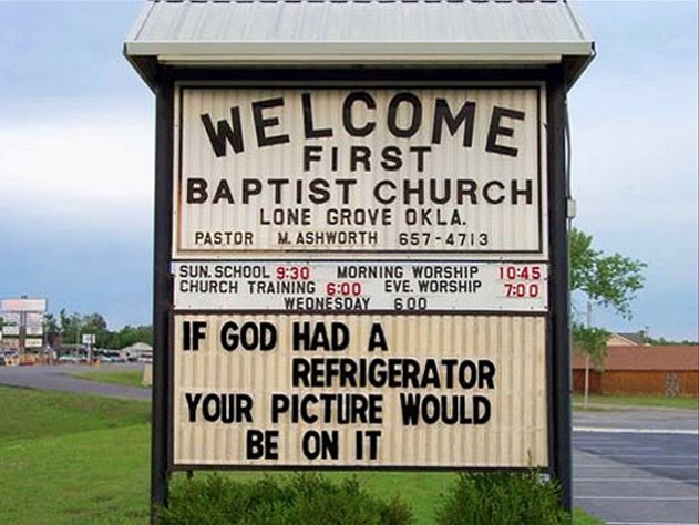
Art 41 Basel opens today with nearly three-hundred leading galleries from across the Modern and contemporary art world all claiming a stake in the idyllic and culturally rich Swiss town. I'm particularly interested in this year's New Jerseyy offering of new works by American artist Rob Pruitt. Gaining prominence as a collaborative partnership under the moniker Pruitt-Early in the early nineties, Pruitt has continued to exhibit solo throughout America with rare sightings of his work across the atlantic. Church signs are the main inspiration for the exhibition at this year's Art Basel, Holy Crap, as well as a DJ mixing Bible tracks and selected items from the artist's collection of Panda memorabilia which has featured heavily in his previous works.
If you want to join the pilgrimage click here for more information about New Jerseyy at Hüningerstrasse 18, CH-4056 and other events at Art 41 Basel.

11.6.10

NY In Motion

News from the other side of the Atlantic is that we are baby steps away from finalising a location and wall for my 31 x 9ft installation of Flamingo Parade (2009-2010). The next event to hit the Manhattan Valley will be on the 21st June where other proposed projects for the West 104th Street Community Garden will be on display, with an evening showreel of video works being projected onto the walls of the garden - a great idea for a balmy summer's evening in New York City!
Flamingo Parade (2009-2010)
The exhibition, A Lot Of Possibilities #2, continues to be on display at WinterSpace by appointment only and a new digital work of Flamingo Parade is a recent addition to the space. The animation brings the repeat pattern to life by creating a journey of the pattern's elements as well as a graphic narrative of my inspirations while I was in New York. Behold the Flamingoes in motion...


Visit WinterSpace for updates and information on the projects on show in A Lot Of Possibilities #2.

9.6.10

The Apple Of Temptation

So I forgot to mention that Exeter's Mac store happened to be the most empty Apple establishment I have even seen - there were more staff hanging around than customers and it was raining! So what better time to cave into temptation and have a go with the new iPad in tranquility. I have to admit I was won over and I must say it proved to be the perfect device to read this blog and browse my work on the multi-touch screen at jonathanvelardi.com...