31.8.11

Peel Slowly & See

There are ways to create a media frenzy for the launch of a product and there are ways to create a media frenzy for the launch of Dasha Zhukova's new art magazine Garage, titled after her successful gallery space, Garage Center for Contemporary Culture in Moscow. Photographed by designer Hedi Slimane, the provocative cover of the art world's new publication sees the bottom half of model, Shauna Taylor with a tattoo designed by Damien Hirst on her vagina. Inked by London-based tattooist Mo Coppoletta at The Family Business Tattoo Shop, Miss Taylor loves the trademark butterfly design by Hirst,

"I would have been stupid not to be part of this project. I have a piece of art on my vagina. Not one person can ever say that they gave birth through a Damien Hirst piece of art. I can".

That you can Shauna, that you can.

Garage No. 1 Magazine will debut later in the year with two more exclusive covers by Dinos Chapman and Richard Prince who will be competing with a naked model's vagina seductively covered by a large butterfly sticker once the issue hits newsstands - get back to the drawing board lads.

30.8.11

What's French For "Edgy"?


Renowned as the luxury capital of the world and equally famed for its graffiti culture, France embodies both #highlife and #lowlife of the everyday - where a fresh baguette for a Euro from the corner bakery can rival any accompaniment with a vintage bottle of Pétrus and therefore no surprise that high and low culture cross rues – 24 rue Faubourg Saint-Honoré to be precise, as Hermès has teamed up with banlieue graffiti artist Cyril ‘Kongo’ Phan for the luxury House’s latest carré collaboration for its Autumn/Winter 2011 collection.

Hermès X Kongo Graff carré, 2011
The collaboration supports Kongo’s International Festival of Graffiti, of which the artist co-founded, as well as the graffiti artists’ collective Kosmopolis that will tour eight countries and provide opportunities for street artists to paint public murals in every city, all subsequently supported by proceeds from the Hermès X Kongo Graff carré that are now available at all Hermès boutiques.
Louis Vuitton X Stephen Sprouse, 2009
Several coloruways in Kongo’s bold trademark tag designs have been produced onto the House’s finest silk scarves and while collaborations are not unfamiliar territory (Daniel BurenSouvenirs For All Seasons October 2010), critics have been musing as to whether Hermès has sacrificed its subtle, sophisticated and timeless identity by working with a street artist to produce such loud and urban designs – words rarely associated with the cashmere furnishings and clemence leather trimmings usually associated with the brand. While the cause behind the collaboration is in tune with Hermès’s international support for the arts, direct comparison can be made with LVHM rival Louis Vuitton who collaborated with the late Eighties American artist Stephen Sprouse in 2009 that saw neon graffiti emblazoned on the label’s fashion and leather collections. Perhaps a message from one House to another amidst the stealth tactics that saw LVHM acquire a stake in the family-owned Hermès company over the last twelve months? If so, Hermès has chosen to take to the streets en force with Kongo’s colourful tags and accents that result in an exciting and unique direction for the classic luxury brand, succumbing to recent trends of extreme partnerships and dare I say it, edgy, making the then-contemporary Sprouse collaboration passé.
Look out for the new season’s window displays of graffiti murals composed of Hermès’s signature orange boxes and visit the World of Hermès for more information about the Graff carré and updates on the Kosmopolis tour.

27.8.11

Just Deserts

While the daily front pages of newspapers after major world events try to encapsulate the night before, it is the cover of TIME Magazine that embodies the past, present and future all on one page. This week the web is crowning American illustrator Tim O'Brien as the 'go-to guy for fallen dictators'. Celebrated for his Osama Bin Laden TIME cover in May of this year, O'Brien creates another iconic portrait to what could be an end of an era for the Libyan dictator Muammar Gaddafi. Since the Libyan dictator is still on the run, O'Brien portrays Gaddafi in sand, his face only half blown away - no red Xs here quite yet - and although the TIME issue will not hit newsstands until 5th September, it also acts a metaphor for a country literally deserted by its migrant population and whose political and economic future is very much uncertain, rising out of an autocracy that lasted nearly half a century. What is certain is that the Libyan rebels hope Gaddafi will turn into a distant and forgotten mirage in the Eastern Sahara and this North African Spring can begin a new chapter in its history.
Visit Tim O'Brien's official website for more information about the cover and his own thoughts about the design process behind his work for TIME and other international periodicals.
Images courtesy of Tim O'Brien

24.8.11

In The Wild: Jungle City

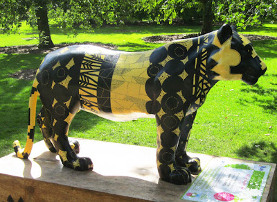
Last week Jungle City was officially unleashed onto Scotland at the Royal Botanic Gardens, Edinburgh. With the incredible success of last year’s Elephant Parade in London, the animal conservation organisation Elephant Family will be calling Edinburgh home for the next two months in what will be Scotland’s largest public art event. Over one hundred and thirty crocodiles, orangutans, hornbills, tigers and elephants have been transformed into fantastical creations by artists, designers and celebrities from Scotland, England and around the world, all with the hope of raising £1 million for these endangered species. I was honoured to have been invited to design a tiger earlier in the year and it’s great to know that within its opening hours last week Jungle City was already gaining the publicity it so deserves, with a segment on BBC Scotland News.

Having had the pleasure of meeting a handful of artists and designers at the London studios while I was creating my very own tiger, Tribal Tigris, it is certainly a sight to see all the animals in one place, at the tropical surroundings of the Royal Botanic Gardens and a big thank you to the talented @CazHaigh who managed to make the journey Northwards to view all the animals - including her own orangutan, Hati - to take brilliant documentation of the event. Please visit Caz Haigh's website for more images from the Royal Botanic Gardens and Harvey Nichols as well as viewing her amazing illustrative works and projects!

Tigers are ironically immortalised into symbols of identity – such as logos and mascots – when in reality they are being driven to extinction. Tribal Tigris explores the importance of identity through native markings across the sculpture painted by hand that include arrow designs and conceptual targets referring to its Persian derivative ‘tigris’. Tribal Tigris is painted with event-sponsor Farrow & Ball 'Babouche' and 'Pitch Black' eco friendly paint.

Jungle City takes shelter in the temperamental summer at the Royal Botanic Gardens until 4th September before the herd escape onto the streets, institutions and public spaces from 6th September. Visit the official website for Jungle City for a schedule of events and details of the art auction taking place in Edinburgh with Sotheby's and further information about Elephant Family’s important conservation work around the world.

Don't forget to get in touch @JMVELARDI if you find yourself in Edinburgh and look out for Tribal Tigris in the urban jungle that will Edinburgh this summer!

22.8.11

Supreme Shag

Hype has already begun across the pond for Supreme's bi-coastal launch of its Fall/Winter 2011 Collection next week which will see a series of new collaborations across the brand's trademark products. Whether you're after the classic camp caps now available in Loro Piana cashmere or Woolrich wool, the 'Biggie' t-shirt produced with Bad Boy Records or the gold Zippo lighter, Supreme have encapsulated the best of urban lifestyle, adding their own iconic red box logo to the mix. And if that wasn't enough, the brand step up their game and logo-fy the entire city of New York with this genius trailer, Aerial, that marks next week's launch below.


My favourite item in the new collection is the 'FUCK' rug created with Japanese design studio Gallery 1950 - inspired by Robert Indiana's infamous LOVE (1964). Measuring 32 x 32 inches, Supreme makes sure to put the shag into shag pile this Winter.


Supreme Fall/Winter 2011 collection will be available in stores in New York & Los Angeles on 25th August, in Japan on 27th August and in London on 22nd September 2011.

Fast-Pop Culture

Did anyone catch the new McDonald's television commercial on prime time over the weekend? I have to admit that the sixty-second ad got my attention, and while it was most certainly not for the food - I haven't stepped into a McDdonald's since the days when Disney only released one movie a year and the Happy Meal toy felt like the only thing worth living for - it was the creative art-direction that saw larger than life Happy Meal boxes installed in various locations around the country to mark the company's new "We Do Happy" campaign.
Directed by Neil Gorringe for Leo Burnett London, a collection of five playhouses in the shape of Happy Meal boxes have been created which show families interacting with the iconic red and yellow box in public spaces such as the British high street and outdoor spaces, including a park and beach. While the fur-covered, inflatable and art canvas boxes were playful for their Oldenburg super size aesthetic, it was the reflective box that was installed in Sutton High Street that had me screaming at my television - is that a Jeff Koons Happy Meal box?
It was definitely a double take moment. I'm surprised that Koons, whose nine-foot tall and four-foot deep sculpture Hanging Heart, which sold for near twenty-seven million dollars in 2007 making it the most expensive work of art sold by a living artist at the time, had not made a Happy Meal box himself. Renowned for his transformation of everyday objects into the sublime and shiny, the same polished stainless steel surface that is practically trademark Koons was used to create the iconic children's food box that attracted a lot of attention from shoppers in this southwest London borough.
While it is an ad agencies dream to make the eight-figure sums Koons now demands, Leo Burnett London have successfully looked to the art world for inspiration quite literally out of the box. Unfortunately the ad doesn't encourage me to go to McDonald's and relive my Eighties childhood, however if they launched Happy Meal box toys à la Koons I'd be there as fast as you can say 'small fries and a large Coke'.
Jeff Koons - Hanging Heart, 1994-2006

Teamed with the jumpy beats of Dave Clark Five's Glad All Over track, McDonald's "We Do Happy" campaign brings together haute art with Pop cuisine. I'm lovin' it. Are you?

14.8.11

#highlife #lowlife

How high octane was last week? Actions that are usually left to areas North of the Watford Gap service station for Southerners and Westminster to view from afar in zoo-like fashion, it was London that was to balance on the edge of becoming an international embarrassment with the spread of community pillaging by the capital’s acquisitive gangs that tragically resulted in five deaths across the country.
Kids as young as 11 years old looted shopping high streets across the city in moonlight and unabashedly broad day light that reflected the absolute disrespect of a sector of youth society who originate from brokenness of generations past. The obvious high-value item retailers were targeted: Plasma-central Comet and Currys, urban brand mecca JD Sports to pick up a year’s worth of Reebok Classics and polyester tracksuits - all in not-so-obvious areas of the city that unfortunately do not benefit from the monitored pavements of more affluent quarters. While the Armanis and Pradas of Sloane Street and New Bond Street took precautionary measures of clearing their windows of their luxury items, diners at The Ledbury in Notting Hill were not so lucky to avoid the violent shamelessness (The Telegraph UK The Ledbury) that made it clear this was much more than acts of opportunist criminality but an intentional attack on the rich with their expensive cars, homes and lifestyle that kids who don't have, want (BBC News UK Showing the rich we do what we want). Kids who have picked up key words such as “Cameron, Eton, Tories and Tuscany” endlessly repeated like a mantra by opposition political parties that somehow resulted in the direct attack of a hard working Mother of two who owns an independent baby clothes boutique in Ealing (BBC News UK – Liz Pilgrim) bizarrely associating her with this silver spoon lifestyle that is thrown around by the media like abusive propaganda, as it is so seen in the distorted eyes of this country’s gang culture. Just how delusional is the reasoning of these actions? Who is to blame for sending these absurd messages to Britain’s youth who are driven to anarchy in their own communities? The finger has been pointed at everyone: the parents, politicians and British music and celebrity culture.

There is an abundance of critical information about Class, Race, Politics and Society on the internet as a result of last week’s devastating chapter in Britain’s social history. Like millions of people across the country I took to twitter to express my views, share other people’s opinions and try to understand the underlying causes. Londoners tweeted street clean-ups and promoted support for victims from riot-hit neighbourhoods (Keep Aaron Cutting) that exemplified the Conservative government's intentions of a Big Society who fought back at the minority who cry “destitution” while they send messages on their new BlackBerry phones. Perhaps they will catch the current UNICEF campaign for famine-stricken Somalia on their new plasma televisions and revaluate their position.

Readers of my blog will know I cover a range of subject matter from politics to Pantone and I try to highlight stories relevant to art, culture, design and creativity as well as my interest in social activity around the world that inspires my own contemporary art practice. So while there will always be a serious cause to fight for and promote, Jay-Z and Kanye West’s pop-up store in SoHo this weekend is just as newsworthy in the creative realm – I defy anyone who doesn't think their album cover designed by Ricardo Tisci (Watch The Throne) is near-orgasmic.

So this week I am launching two hashtags that I have used to define my internet activity and interests for a while now: #highlife and #lowlife. I will be using them on both Twitter and my blog from hereafter to categorise my postings and I would like to invite you to use them in your social media postings - it would be great to know how you define them since what I want to try to do is not merely capture what is 'highbrow' or 'lowbrow' but the interesting crossovers that happen within the creative realm.

High Art? Julian Schnabel -The Ones You Didn't Write - The Maybach Car 2011

Living the high life? Jay-Z & Kanye West - Otis 2011

Whether you think the crass customisation of a Maybach in Jay-Z and Kanye West's Otis video is any more #lowlife than Julian Schnabel's gun-shot The Ones You Didn't Write - The Maybach Car at this year's Venice Biennale which by default assumes #highlife status is the interesting dialogues that I hope to create with you all. So get in touch with your thoughts!

Join me @JMVELARDI for the #highlife and #lowlife of the everyday…

6.8.11

Mondrian À La Mode

This week's posts on artists' influences on commercial brands reminded me of the power campaigns from the late-Eighties. I can distinctly remember L'Oréal's Studio Line and its use of a Piet Mondrian-inspired design of primary colour blocking for its brand identity and visual merchandising. Look past the bouffant hairstyles and you notice the campaign's background alludes to a white cube space - perhaps an artist's studio where one must only wear white - and not a 'because you're worth it' slogan in sight! These images are going in the inspiration archives...

4.8.11

MAC x Cindy Sherman

The collaborative corral keeps giving this season with Supreme X Damien Hirst (Summer Supreme June 2011) and yesterday's post on Fred Perry X Sir Peter Blake (Mod-ern Love-rs August 2011) contributing to this summer’s highlights. Today I bring you another artist collaboration that has had art and fashion worlds alike asking, 'why hasn’t this happened sooner?'
Cindy Sherman, photographer, filmmaker and guise-extraordinaire will release an artistic collection for MAC cosmetics. This is possibly the most obvious collaboration of them all - Sherman’s celebrated self-portraits see her transform her own features into exaggerated depictions of the female stereotype such as off-kilter Hitchcock heroine, Caravaggio Portrait or Park Avenue Plastic Surgery Maven.
The cult beauty brand is a major player, respected in the worlds of high fashion and make up for the stage and the collaboration with Sherman will only profit from the recent avant-garde style that is being pioneered by Lady Gaga as well as gaining major culture points with customers who want to purchase a piece of Sherman magic. With the launch of a series of three trademark Sherman advertising campaigns, MAC call's this exciting partnership,
"... the campaign we've longed forever to conceive... we're living in a time when people of all persuasions have become bolder than ever about the ways they choose to express themselves: with a colourful palette of possibilities, You are the Artist, You are your own Subject..."
Like all collaborations this summer, the Cindy Sherman for MAC collection will be limited edition and is another sign that brands are redefining marketing strategies for the luxury market: take a familiar product that was once accessible, pair it up with a celebrity figure (with bonus cultural caché) and label it ‘limited edition’. Bingo.

The collection of lipsticks, eyeliners and eyeshadows will be available from 29th September until the end of October, just before Halloween - one of the most profitable periods of the year for the brand – giving the ladies this Halloween a catalogue of inspiration from Sherman's extravagant characters such as #96, #360 or #469 that will compete with any witch or sexy nurse costume at the party. 

3.8.11

Mod-ern Love-rs

Launched at Wimbledon in 1952 by celebrated Grand Slam English tennis player, Frederick John Perry, the now Japanese owned fashion brand Fred Perry continues to provide cotton pique shirts and tailored clothing to their strong customer base of revival Mods and the fashion-conscious punk rock underground scene that resonates as much today from Wardour Street, London to Southern California and across Japan. 
The brand continues to celebrate its heritage by teaming up with art world legend Sir Peter Blake with a series of limited edition designs and colourways onto Fred Perry's popular M12 shirt. Since the late Fifties Blake has worked with a variety of imagery sourced from advertisements and objects of the everyday to create intricate collages that define social landmarks in Britain's cultural evolution. Blake is also one of very few artists who expand their practice into the commercial arena - where his inspiration is firmly rooted - which has seen successful collaborations with the worlds of fashion (Lucky Brand Jeans & Stella McCartney), sport (Chelsea Football Club x Addidas) and his continued relationship with the music industry after his acclaimed cover art for the Beatles' album, Sgt. Pepper's Lonely Hearts Club Band back in 1967, working with Paul Weller and Oasis to name a few.
For Fred Perry's Laurel Wreath Collection, Blake's 'Blank Canvas' designs incorporate his signature icons of stars, hearts, targets and even his trademark 'LOVE' that ties nicely with the brand's tennis history. The screen printed and patchwork details provide the limited edition of 1000 shirts that collectors-item quality and Pop art aesthetic with their custom designed gift box in respective colourways - click here to view more details and purchasing enquiries of Sir Peter Blake's 2011 'Blank Canvas' series for Fred Perry.

Images courtesy Fred Perry